
Not for choosing.
For seeing.
They won’t tell you what to pick.
They show how colour behaves.
colour


PERSPECTIVE
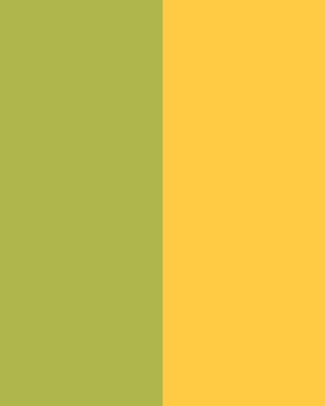
Colours don’t stay the same.
They shift next to each other.
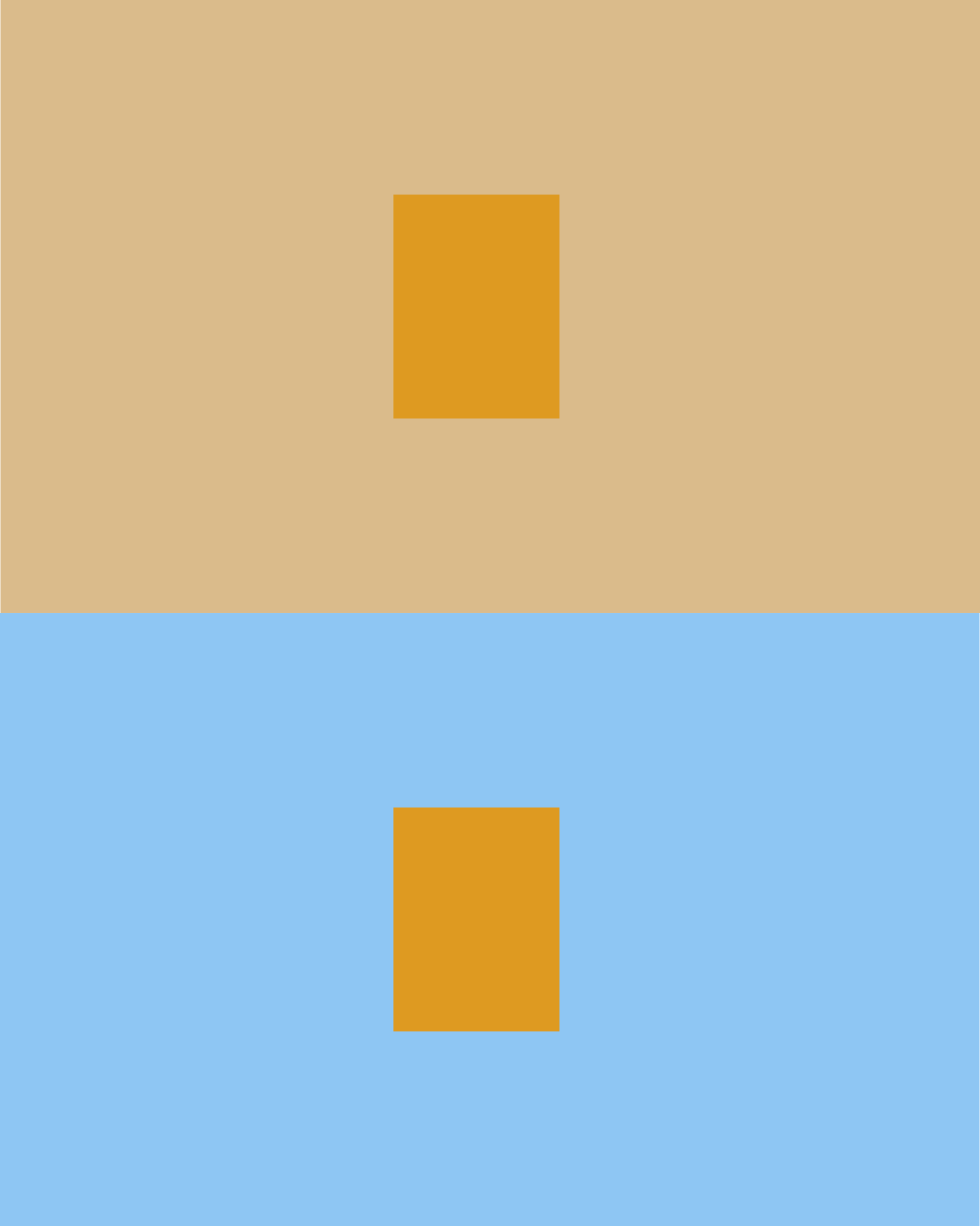
Same colour. It shifts.
FRIENDS settle.
They calm.


LOVERS won’t settle.
They push.
Soft tones lift.

Strong colour adds weight.
It expands.
More.


Less. It contracts.

Some colours hold.

Others push.
MEETING
Edges are decisions. When colours meet, they react.

LOVERS sharpen the edge.
They vibrate. They pull apart.
FRIENDS soften the edge.
They bleed. They stay close.

Watch the edges.

High contrast draws a line.
Low contrast builds volume.

The top meets them all.
It anchors.
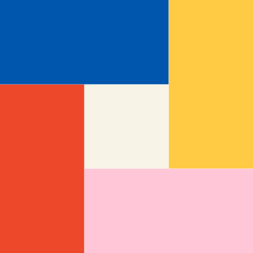
It can hold the sides together.
Or pull them apart.
tension
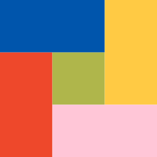
Some colours make each other better.
Others don’t.
Some colours are easy to love.

But too much ease can feel static. Dead.
Other colours resist.
They don’t settle.
They add edge. Friction.

Friction can make the object feel alive.
Or break it.
CONTEXT
Same colour. But different.
Scale shifts colour.


A colour that feels intense on a wall can soften on a smaller object.
Light shifts them.

A colour can feel clean on screen.
But wash out in daylight.

Texture can soften or sharpen.
Gloss lifts or flattens.
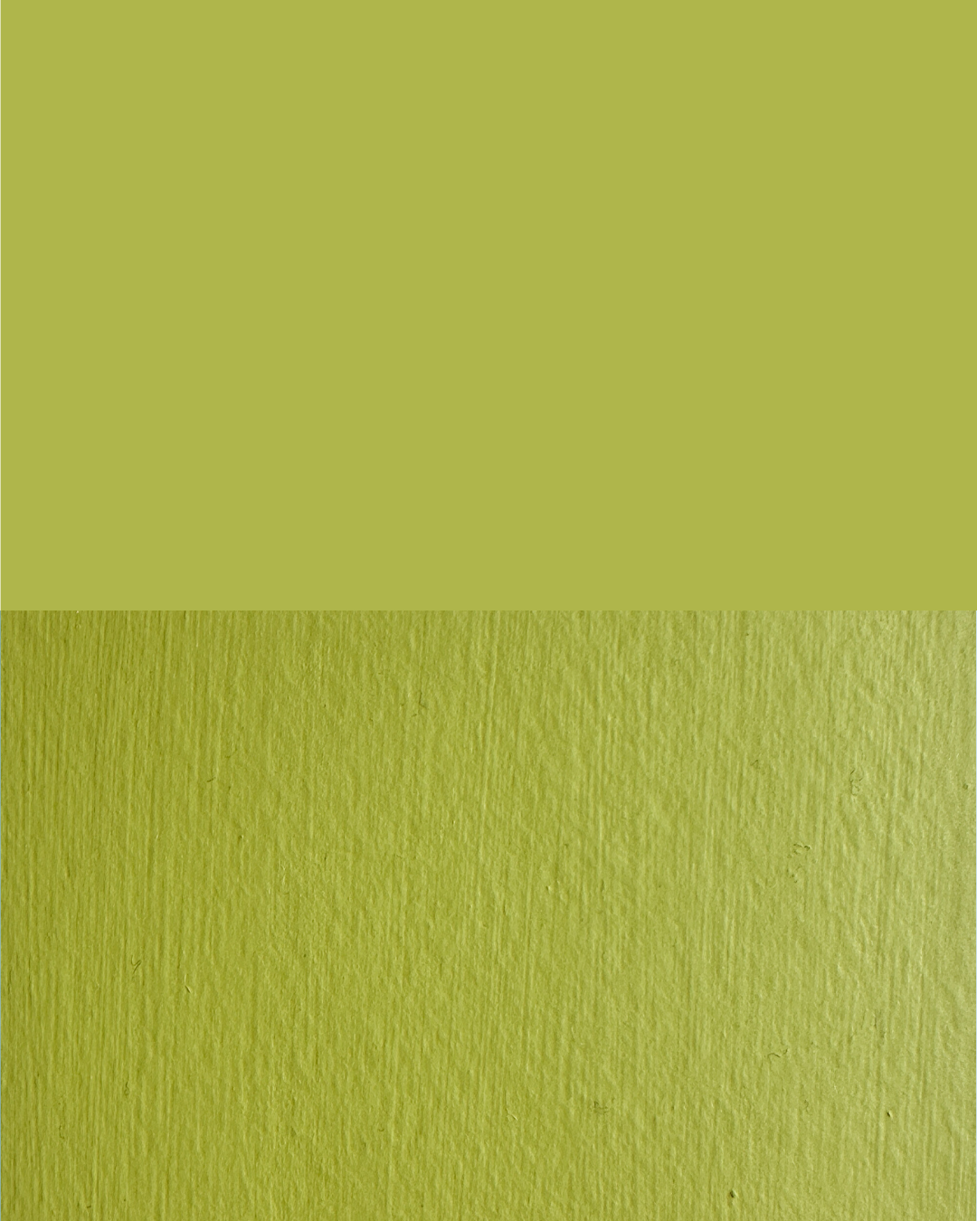
Screens never tell the full story.